How to Create Premium Gradients with ChatGPT Images 2.0
Many people use AI to generate gradient visuals with the same mindset:
Write a new prompt every time, swap a few color words, and hope for something fresh.
The result is usually one of two things:
- Random images with no consistency.
- Nearly identical images with different colors.
This is not a model problem. It is a creative process problem.
Strong design work rarely starts from zero every time. It starts with a visual language, then expands into new palettes, moods, and applications while staying consistent.
That is how branding works.
A real brand does not change its typography, composition, and style for every campaign. It builds a system, then evolves within it.
The same principle applies when creating gradients with ChatGPT.
If you want professional, reusable, scalable visuals, the goal is not endless trial and error. The goal is to build your own gradient design system.
1. Why Do AI Gradient Images Often Look the Same?
Most prompts only change surface-level words like:
- blue
- purple
- pink
- orange
But color alone does not create visual difference.
What actually changes the image is the deeper structure:
- Composition
- Focal point placement
- Light direction
- Texture behavior
- Negative space
- Motion rhythm
- Material feeling
- Brand personality
If these stay the same, the output will feel like the same design in different colors.
It is like applying five color themes to the same website template.
For more on why AI gravitates toward certain color defaults, see our earlier piece on why AI has an indigo obsession in web design.
2. The Better Approach: Build a Master Gradient Style First
Instead of starting over every time, define one strong visual structure first.
For example:
- Designed for a website hero section
- Text content on the left
- Visual focus on the right
- Soft flowing movement
- Layered depth
- Plenty of breathing room
- Premium modern tech feel
At this stage, you are not choosing colors. You are defining visual rules.
3. Master Prompt Template (Use Long-Term)
Think of this as your base template. You can reuse it again and again by only changing the palette.
modern website hero section, wide 16:9 composition, clean content space on left side for headline and buttons, luminous flowing gradient focal element on right side, layered soft depth, elegant negative space, refined premium lighting, smooth transitions, realistic landing page atmosphere, ultra clean composition, no textThis prompt works because it defines the system:
website hero section→ clear use casecontent space on left side→ room for UI copyfocal element on right side→ visual hierarchylayered soft depth→ dimensionnegative space→ breathing roomrealistic landing page atmosphere→ more useful than abstract wallpaper
This is the foundation.
4. One Style, Five Different Color Directions
Now we extend the same structure into multiple brand moods.
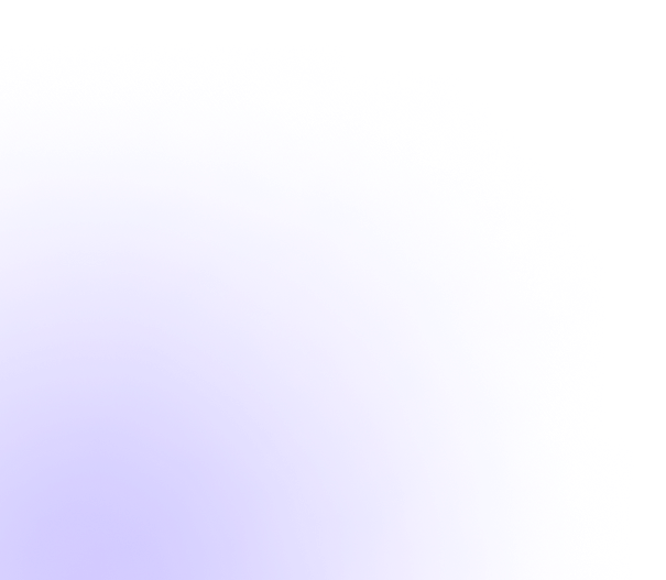
1. Tech Blue / Violet (For SaaS / AI Products)
Calm, trustworthy, futuristic.
modern website hero section, wide 16:9 composition, clean content space on left side for headline and buttons, luminous flowing gradient focal element on right side, blue, cyan and violet palette, layered soft depth, elegant negative space, refined premium lighting, smooth transitions, realistic landing page atmosphere, ultra clean composition, no text
Design perspective:
Blue builds trust. Violet suggests innovation. Cyan adds a digital feel.
Use blue as the dominant tone to avoid an overly flashy result.
2. Silver / Gold Luxury (For Premium Brands / Product Launches)
Quiet, elegant, expensive.
modern website hero section, wide 16:9 composition, clean content space on left side for headline and buttons, luminous flowing gradient focal element on right side, pearl white, warm silver and champagne gold palette, layered soft depth, elegant negative space, subtle spotlight, smooth premium surface, realistic landing page atmosphere, ultra clean composition, no text
Design perspective:
Luxury usually comes from restraint, not brightness.
Champagne gold often feels more modern than saturated gold.
3. Growth Energy Palette (For Startups / Youth Brands)
Fast, expressive, optimistic.
modern website hero section, wide 16:9 composition, clean content space on left side for headline and buttons, dynamic flowing gradient focal element on right side, coral orange, magenta and violet palette, layered soft depth, energetic motion feeling, spacious negative space, modern startup atmosphere, ultra clean composition, no text
Design perspective:
Warm tones create action and momentum.
Balance them with cooler tones so the image stays clean.
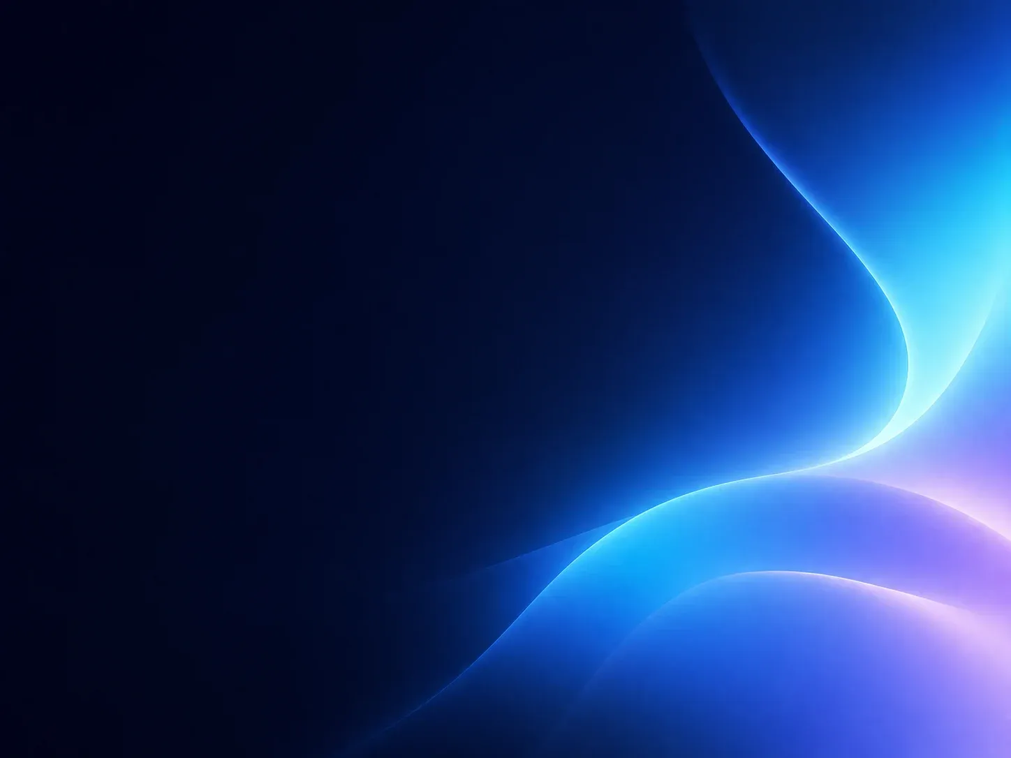
4. Dark Future Mode (For AI Tools / Dashboards)
Immersive, sharp, technical.
modern website hero section, wide 16:9 composition, clean content space on left side for headline and buttons, glowing gradient focal element on right side, deep navy black background, electric blue and purple accents, cinematic shadows, layered soft depth, futuristic interface atmosphere, premium dark composition, no text
Design perspective:
Dark backgrounds increase contrast and make the focal area stronger.
Great for data products, AI tools, and developer platforms.
5. Organic Lifestyle Palette (For Wellness / Beauty / Lifestyle Brands)
Soft, human, calming.
modern website hero section, wide 16:9 composition, clean content space on left side for headline and buttons, soft flowing gradient focal element on right side, sage green, cream and sand beige palette, airy sunlight feeling, gentle texture movement, calm premium mood, elegant lifestyle atmosphere, no text
Design perspective:
Lifestyle brands do not need aggressive impact.
Comfort, softness, and breathing space matter more.
5. How to Expand Into More Palettes Without Losing Consistency
Only replace the palette section.
Example:
Original:
blue, cyan and violet paletteReplace with:
emerald, teal and aqua paletteOr:
lavender, rose and cream paletteOr:
charcoal, silver and ice blue paletteKeep the structure. Change the mood.
That is how you create variation with consistency.
6. How to Avoid Generic AI-Looking Results
Because you are not generating random images — you are building a visual system — the same rules that guide traditional designers apply here too: grid systems, typography rules, color logic, composition principles, and brand emotion. AI tools are new. Design fundamentals are not.
With that in mind, here are the practical rules to keep your outputs sharp.
1. Do Not Only Write “abstract gradient background”
That often leads to template-like outputs.
Use contextual phrases such as:
- landing page atmosphere
- premium branding visual
- editorial composition
- product launch scene
These create more believable design intent.
2. Control Effects
Use less of these words:
- neon
- intense glow
- holographic
- cyberpunk
They often create cheap-looking visuals.
3. Emphasize Space
These terms help a lot:
- negative space
- spacious layout
- airy composition
- clean margins
Premium visuals often feel premium because they are restrained.
4. Always Refine in Figma
Treat AI output as raw material.
Then improve it with:
- typography
- UI layout
- cropping
- color correction
- brand consistency
You can also use the CSS Gradient Palette to generate production-ready gradient CSS code that matches your AI-generated color directions.
This is where quality happens.
7. Recommended Workflow
If you run a blog, brand, or design project:
Step 1: Create one master prompt
Define your visual structure once — composition, focal point, mood, and spatial rules. This becomes your reusable foundation.
Step 2: Build 5 palette directions
Choose color families that match different brand moods: trust, energy, luxury, calm, innovation.
Step 3: Generate 10 options for each
Give yourself room to select. The best image is rarely the first one.
Step 4: Select the best one
Pick based on hierarchy, balance, and emotional fit — not just “looks nice.”
Step 5: Refine in Figma
Crop, adjust color, overlay typography, and align with your brand system.
Step 6: Build your own asset library
Save your master prompt, best outputs, and refined assets into a reusable collection you can scale.
8. One Important Thought for Designers
AI can speed up production.
But it does not replace judgment.
What makes a visual feel premium is still:
- hierarchy
- spacing
- balance
- emotion
- restraint
- taste
Tools evolve. Principles remain.
9. Final Thoughts
If you treat AI like a lottery machine, you get random images.
If you treat AI like a system executor, you gain a repeatable creative process.
The real advantage is not generating one lucky image.
It is building a method you can reuse, expand, and improve over time.
That is the real way designers should use AI.