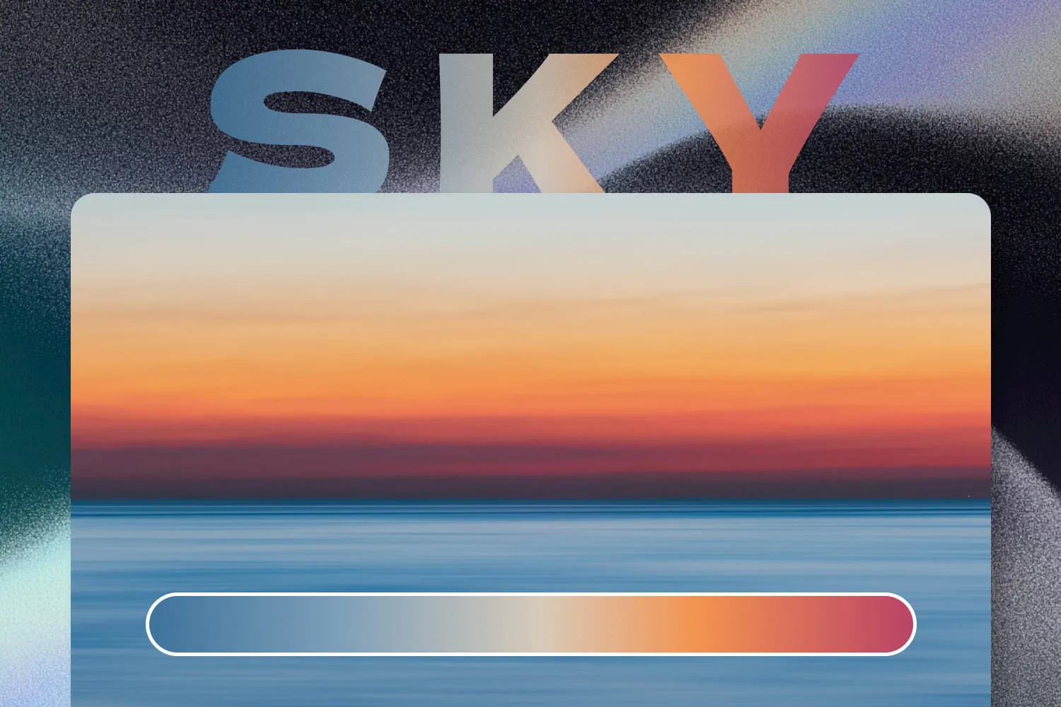
Drawing Gradient Inspiration from the Sky

Sky-Inspired Gradients: How to Design Natural Color Transitions
Gradients show up everywhere in modern interfaces, but the gap between a gradient that feels calm and one that feels fake can be obvious. That reaction isn’t mystical, we’ve spent years watching light change in real life. Our brains quietly store how color usually softens, warms, cools, and fades. When a digital gradient echoes those patterns, it feels right. When it doesn’t, we hesitate, even if we can’t explain why.
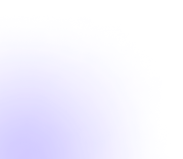
We’re especially tuned to the sky. It surrounds us so constantly that we stop noticing it, yet it keeps training our sense of what a “natural” transition looks like. Wonder why blue is such a default brand and UI color? We live under a huge blue reference panel most days.
Even with smog or city glow, sunrise and sunset still carve out convincing layers of color. That’s a reminder, you don’t have to invent every palette—often you just need to observe more closely.
How to Capture More Authentic Gradients
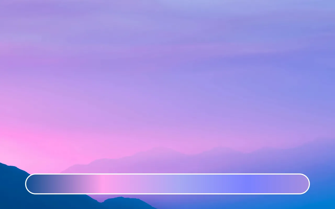
Treat the sky as a library of transition templates. It’s not just “blue” or “red.” Watch how a thin peach strip sits under a cooler dome before the sun appears, or how a violet seam forms between warm haze and deeper blue. Clouds shift luminance and saturation. The sun’s angle changes which wavelengths dominate. Nothing feels abrupt, yet change is constant. That’s the structure you can borrow.
Dawn
Pre-sunrise light tends to stack: deep muted blue above, a lighter bluish band mid-sky, and a faint, low warm wash near the horizon. Sample those bands, and you already have a gradient with depth—cool to less cool to gentle warmth—without pushing saturation.
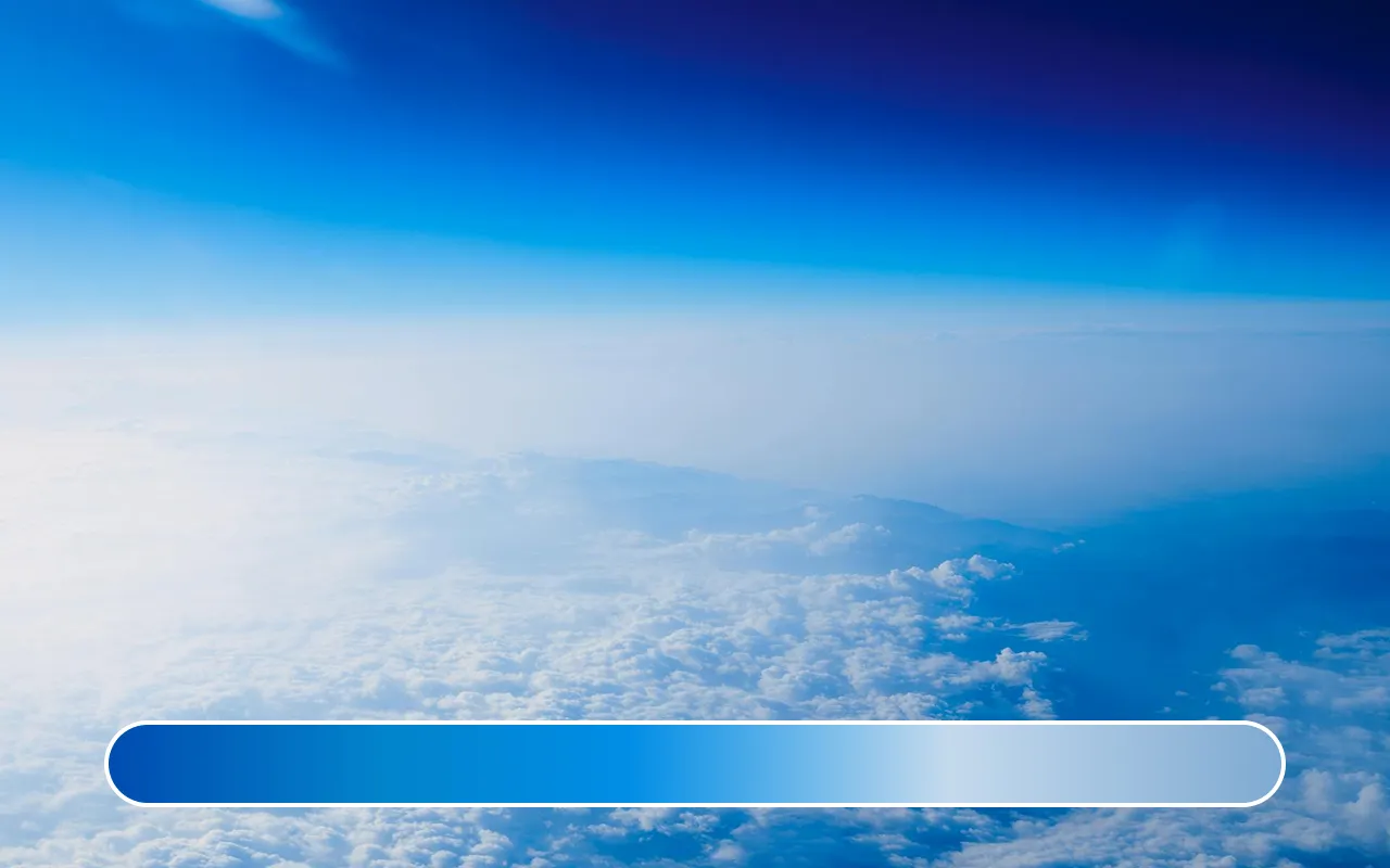
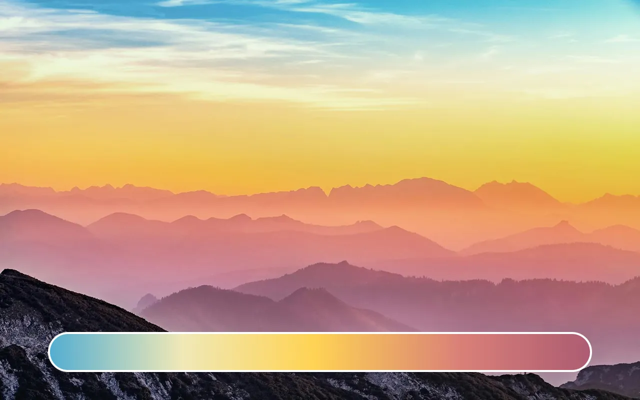
Bright Day Variations
Mid-morning through afternoon, the shift is mostly in lightness and subtle saturation, not wild hue jumps. The zenith is cleaner and more saturated; near the horizon it lightens and grays out slightly (atmospheric haze). That gives you a model for backgrounds that feel fresh but not loud.

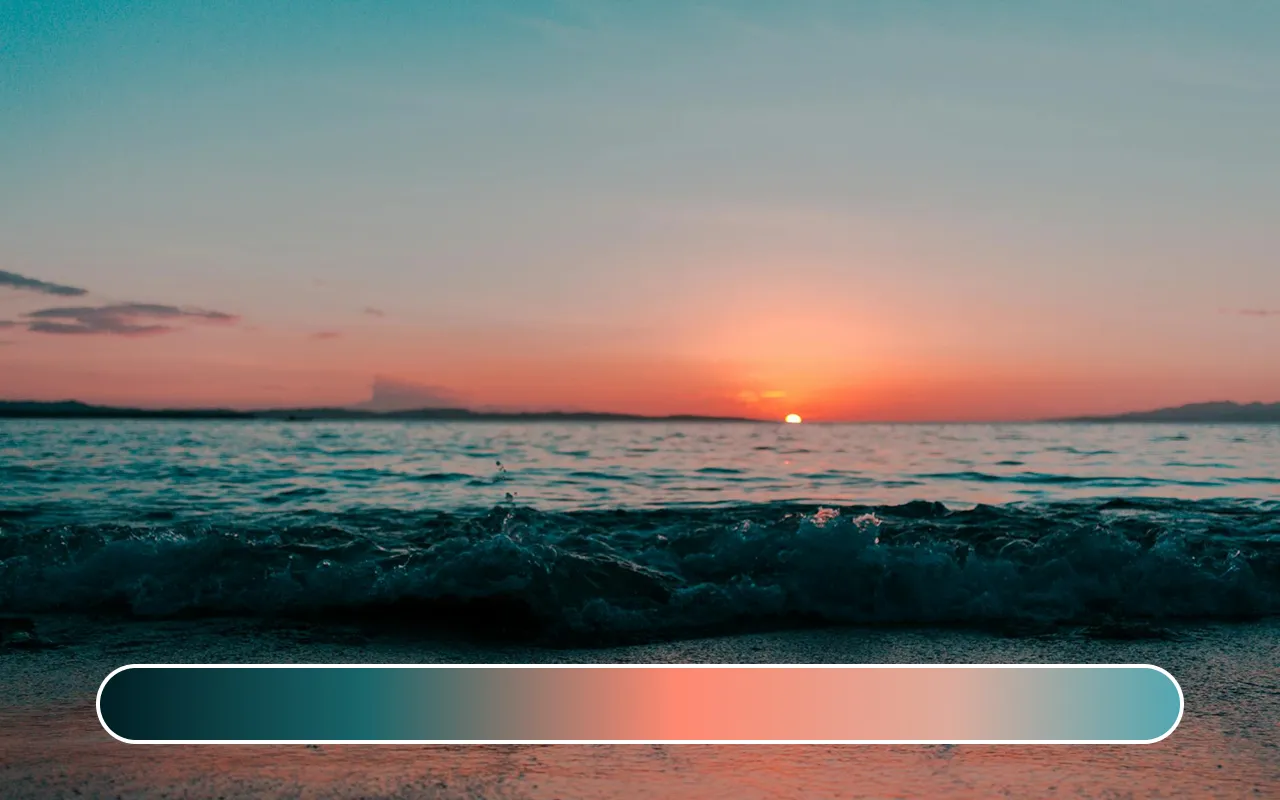
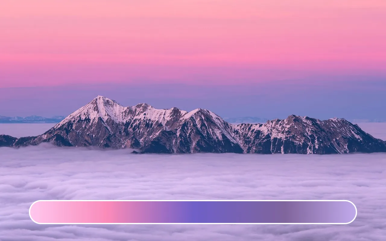
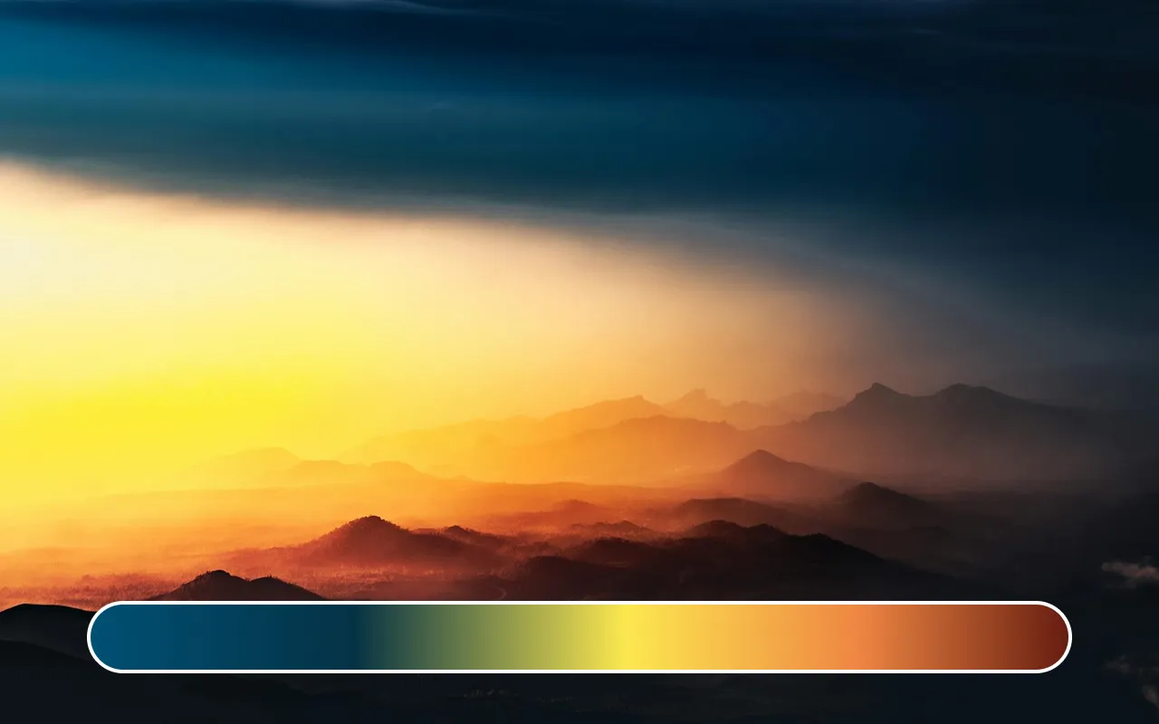
Vibrant Phases
Tropical or humid evenings can stack oranges, coral pinks, magentas, and dusty violets. Temperate zones might soften those into pale apricot, lavender, and powder blue. Instead of copying the loudest orange, capture the transition: the softened intermediary that makes the bright part feel credible.
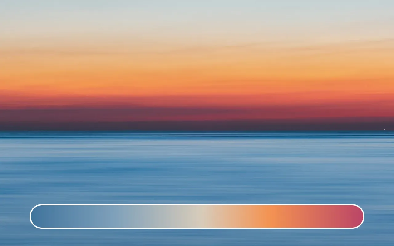
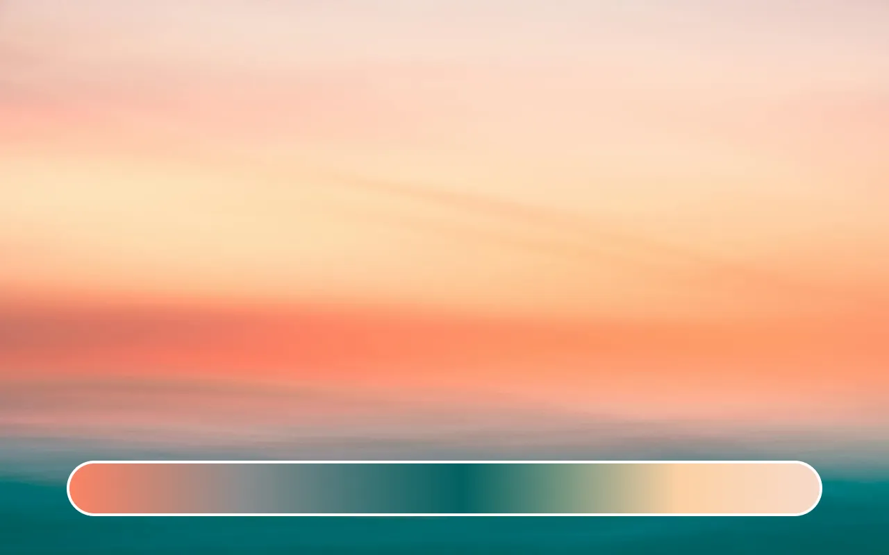
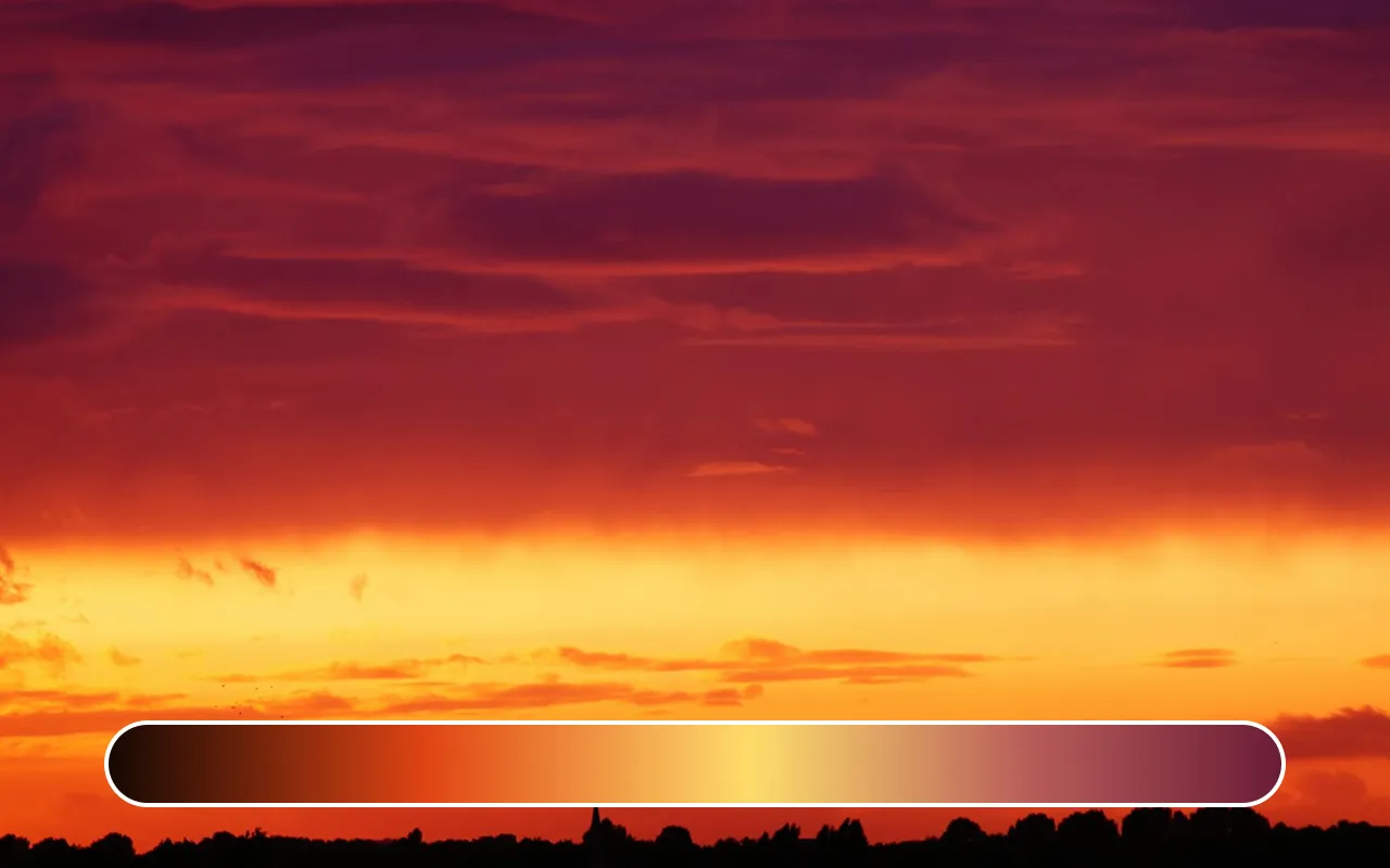
Sunset
As the sun drops, warm bands flatten and spread, then cooler violets and deeper blues reclaim the upper sky. You often see a brief moment where a saturated warm strip sits under a desaturated indigo. That’s a great pattern: high contrast in temperature, controlled contrast in value, which keeps text legible if you lean on the cooler region.
Why Walking Away Matters
Step out from the glass and concrete and give your eyes ten quiet minutes—by water, on a hill, or under a line of trees. You start noticing how small the “steps” between colors really are. The gradients you remembered as bold are built from many tiny, almost polite shifts. Screens push us toward harder contrasts; stare at them too long and both your eyes and brain fatigue. When that happens, you misjudge saturation, push hues too far, or flatten subtle transitions. A short reset outdoors lets your visual system re‑calibrate: softer light, micro–changes in hue, slower shifts in brightness. Looking at the sky’s unhurried gradient is, for me, a simple recharge—rest for the eyes, and a quiet reminder of how gentle effective color movement can be. That small ritual feels less like a pause and more like plugging the senses back in.
Practical Tips to Translate Observation into Design
- Photograph or screen‑grab in RAW or minimally processed form; sample small averaged patches (not single pixels) to reduce noise.
- Map gradient stops in a perceptual space (e.g., OKLCH). Smooth lightness first, adjust chroma second, tweak hue last.
- Introduce at least one bridge stop (cool → neutral → warm) instead of a blunt two‑color blend.
- Reduce saturation 10–25% for UI surfaces; keep a higher‑chroma variant for marketing visuals.
- Test with actual components early (buttons, text, shadows) to avoid polishing an abstract gradient in a vacuum.
- Add a subtle noise layer (very low opacity) on large panels to prevent banding.
Final
Authentic-feeling gradients come from observing how real light shifts: small steps, balanced lightness changes, moderated saturation, and credible intermediate hues. The sky supplies an endless set of quiet transition templates; by sampling, structuring, and gently refining them in perceptual color space—and by periodically resting your visual system outdoors—you build gradients that feel natural instead of forced.