Why Does AI Have an Indigo Obsession in Web Design?

This is a fascinating trend. As AI-generated content explodes in popularity, with more and more products being created by these tools, designers and developers have noticed something odd: why do AI models have such a strong bias toward indigo-heavy blue-purple gradients? Websites generated by AI often feature these gradients prominently—buttons in indigo, card backgrounds with subtle purple fades, and even nav bars and overall backgrounds dominated by shades of blue and purple. Even when no color preferences are specified, AI seems obsessed with this palette, and the backstory—along with its ripple effects—is pretty intriguing.
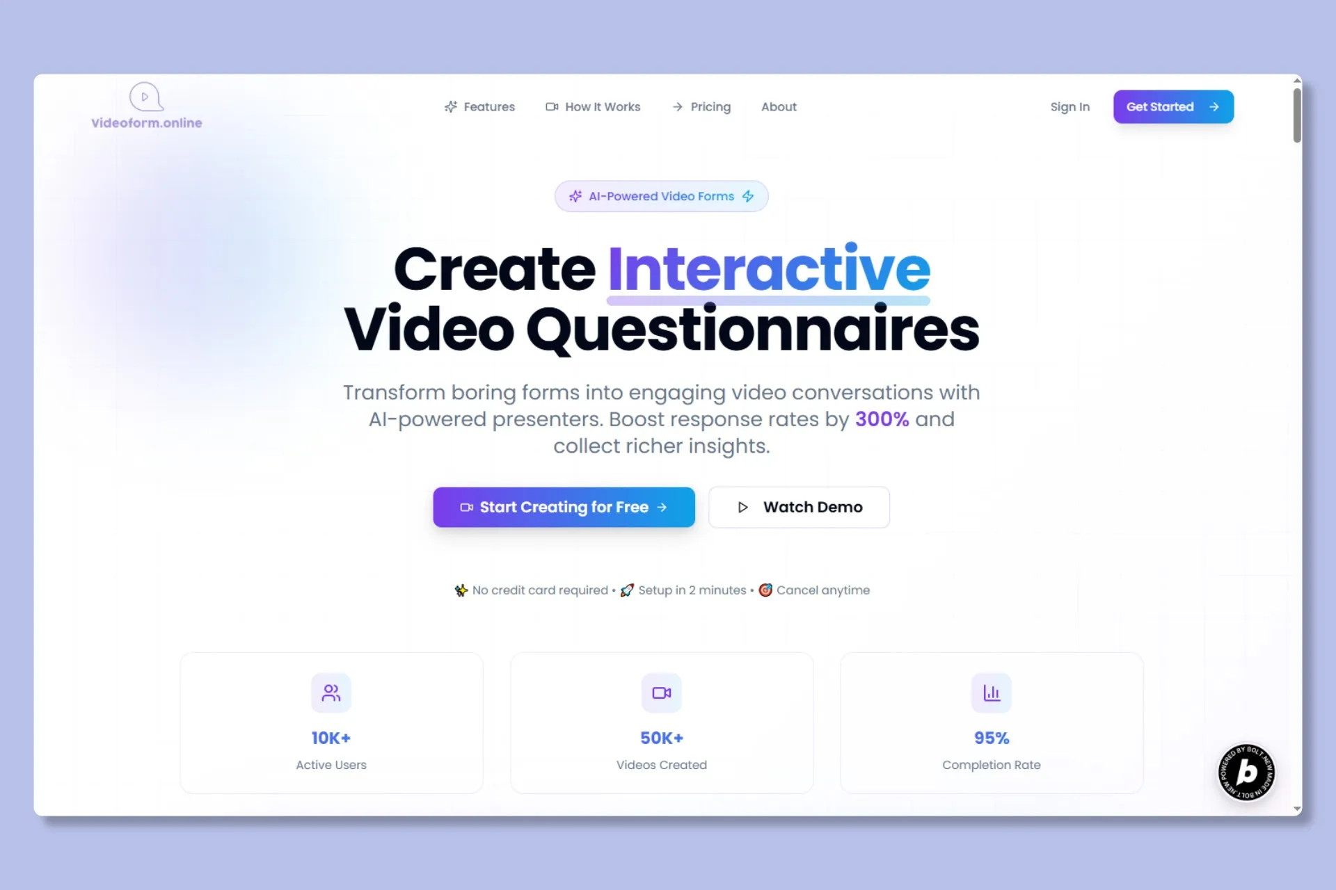
Classic AI Web Style
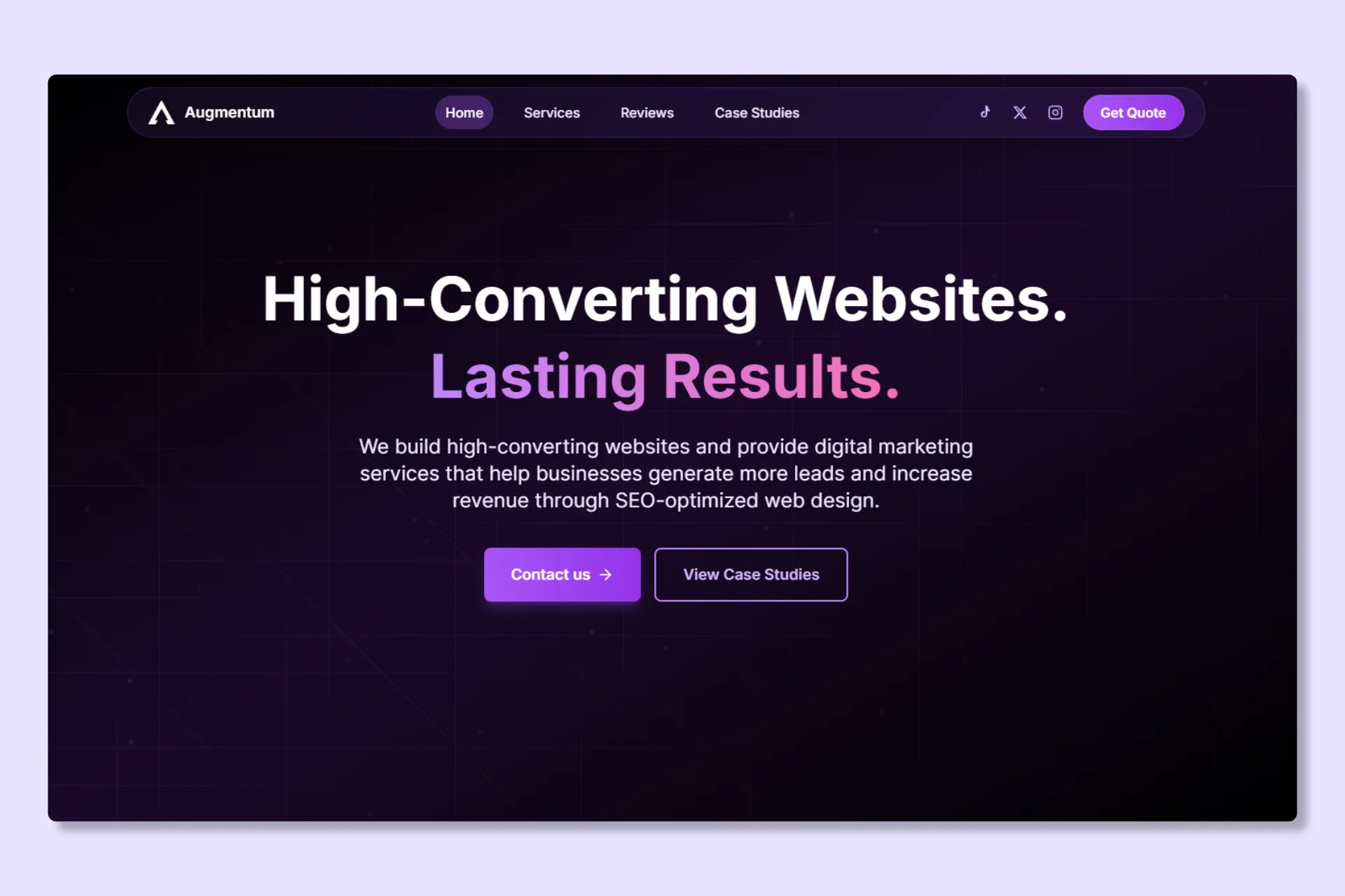
Common AI Color Schemes
Without proper guidance, this default AI styling can start to feel repetitive and uninspiring. It’s best to steer clear of these unrefined outputs.
The story goes back five years to Tailwind CSS. As today’s most popular utility-first CSS framework, Tailwind lets developers build UIs quickly using predefined classes, and its flexibility and efficiency have made it a favorite among frontend devs and designers. In early versions, all default button colors were set to indigo-500. It was a sensible pick at the time: indigo strikes a balance between blue and purple, avoiding the stark “chill” of pure blue or the over-the-top vibe of vibrant purple. It works with most styles, provides solid text contrast, and spares devs from endless color tweaks.
But no one anticipated the butterfly effect this “handy default” would unleash:
- Countless tutorials and tech articles used Tailwind’s indigo-500 in examples, like “button design guides” or “login page prototypes”;
- Open-source repos and community projects defaulted to it for buttons and card gradients;
- All those indigo-500-laden articles, code snippets, and mockups ended up in the training data for AI models.
Much like how designers draw from past influences, AI “learns” from high-frequency patterns in its data—when indigo-500 shows up way more often than other colors, the model treats “indigo-based blue-purple gradients as the go-to for web design” as a baked-in assumption.
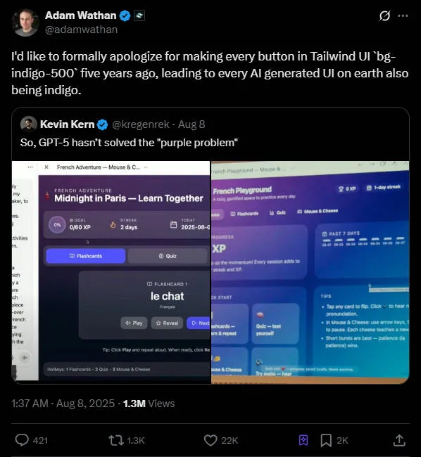
It wasn’t until recently that Tailwind’s creator, Adam Wathan, tweeted: “I’d like to formally apologize for making every button in Tailwind UI bg-indigo-500 five years ago, leading to every AI generated UI on earth also being indigo.” This tongue-in-cheek post shed light on what was essentially a “design fluke.”
Beyond Indigo Gradients: The Sneaky Issue of AI Training Data “Bias”
Adam’s apology might sound like a joke, but it points to a real flaw in AI design: when training data sources are too narrow, it leads to biased outputs.
Have you spotted other design biases in AI? For instance:
- Mobile UI cards always default to 8px or 16px border radii, thanks to widespread adoption of certain design system defaults;
- Icon styles often lean toward line icons, simply because they’re overrepresented in open-source libraries.
These aren’t signs of AI being “uncreative”—it’s just that models can’t discern whether a design element is a happy accident or truly optimal. They base choices on what’s most common in the data. When one style dominates, it creates “path dependency,” homogenizing outputs and stripping away the variety that makes design exciting.
Worse yet, this bias can mislead new designers: if beginners lean heavily on AI for ideas, they might assume there’s only “one right way” to do things, overlooking the need for personalized touches in color and layout.
To dodge AI’s indigo fixation and create gradients that actually suit your project, you don’t need to ditch AI altogether—just nail these two key approaches.
1. Use “Restrictive Prompts” to Guide Outputs Precisely
Rather than vague instructions, restrictive prompts set clear boundaries to get better results faster.
To sidestep indigo gradients, include something like:
“Avoid cool tones like indigo or blue unless the user specifically asks for them” (translated: “Prohibit the use of cool color palettes such as indigo and blue, unless specifically requested by the user”).
This draws a firm line while allowing some wiggle room. Apply the same for other biases:
- For card styles: Specify “Do not use 8px for card border-radius” (“Card border-radius must not be 8px”);
- For icons: Say “Favor filled icons over line-style ones” (“Use filled icons instead of outline icons”).
These prompts combine “exclusion + specificity”, weeding out bad habits while giving AI a solid framework—far more effective than just asking for “something creative.”
2. Pair “Reference Images + Tools” for Gradients with Authentic Feel
For gradients that feel textured and unique, revisit the “observe nature” method from our earlier gradient piece, and boost it with tools like GradientsHub:
- ● Step 1: Draw inspiration from real images: Think sunrise “orange-pink to pale yellow” for an event page, or cloudy “gray-blue to white” for productivity apps—these organic transitions breathe more life than AI’s generic indigo defaults;
- ● Step 2: Create with GradientsHub toolbox. Snap a photo of a gradient you like, upload it to the tool, or use Colorffy (our recommended mesh-gradient generator) for “color picking + blur adjustments” to recreate it. For animated ones, generate code via Color4bg and tweak values manually;
- ● Step 3: Refine with AI: Feed your custom gradient to AI with a prompt like “Using this color scheme, create variations in brightness and saturation for buttons, cards, and backgrounds”—you keep creative control while AI handles the grunt work.
In the End: Design’s Heart Lies in Human Insight
AI’s indigo gradients boil down to a feedback loop: “tool defaults shape habits, habits feed into data, and data shapes tools.” But we can break free—Tailwind’s indigo-500 or AI defaults are just suggestions, not rules.
Gradients aren’t the end goal; they’re tools for visual depth. AI isn’t the boss—it’s an assistant for tedious tasks. What elevates design is always the human touch: pondering “why this color?” and “what mood does this gradient evoke?” After all, nature’s skies aren’t limited to indigo, and great design shouldn’t be stuck in a single mold.